DoThisHere
Jackie (Junrui) Yang, Monica S. Lam, James A. Landay
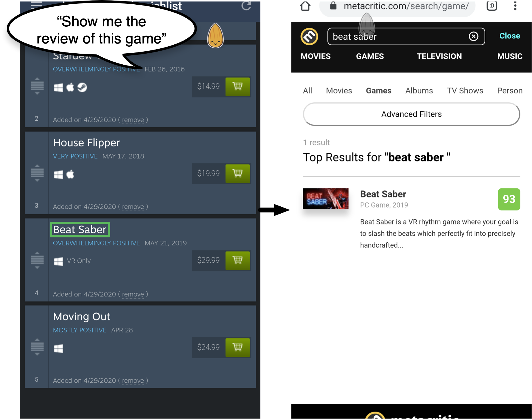
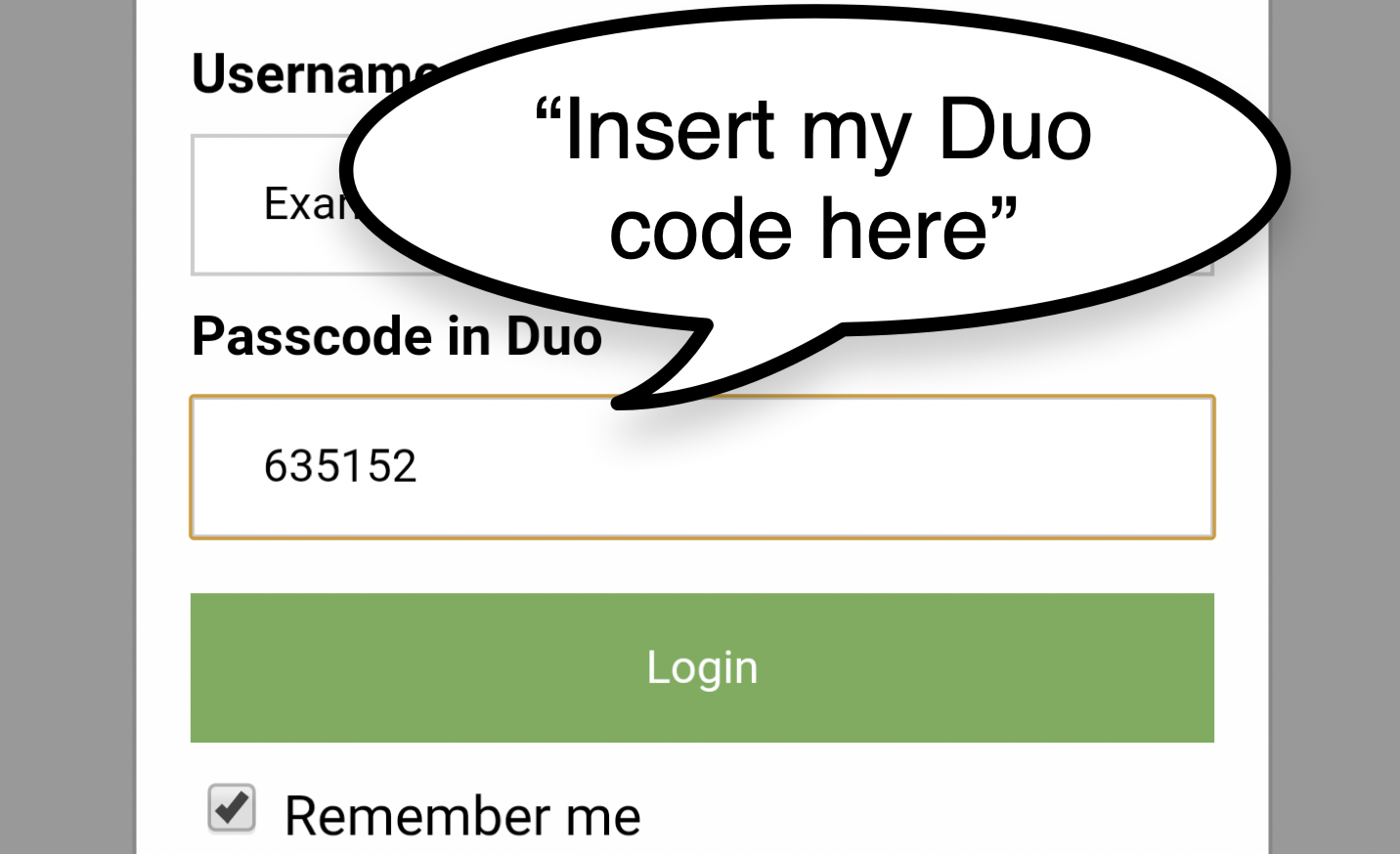
Many computing tasks, such as comparison shopping, two-factor authentication, and checking movie reviews, require using multiple apps together (cross-app tasks). However, today’s smartphones have small screens and limited windowing support, making it hard to switch contexts and exchange data between apps.
Understanding cross-app tasks
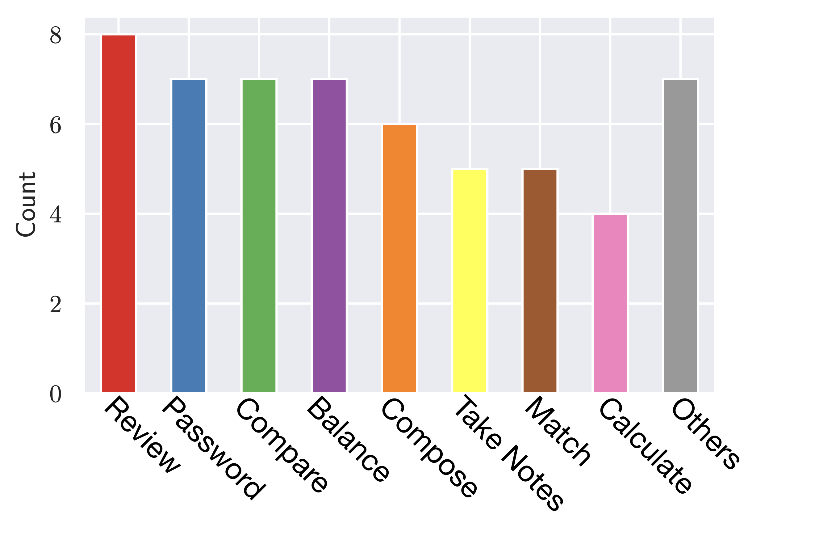
To understand how we can help users complete these cross-app tasks, we conducted a survey on Amazon Mechanical Turk about tasks people are performing or wish to perform that involve multiple apps working together, and the apps involved. We collected 125 valid apps-task tuples from 75 participants and found that 59 (47%) of the tasks mentioned are not well supported by current-generation mobile OSs. We then used open coding to generate a list of categories for these not well-supported tasks.

Among these cross-app tasks, we found the core problem is data exchange between apps. We identified two types of data exchange: simple data exchange (copy-and-paste on the desktop, e.g., review, password, and balance) and complex data exchange (looking at and interpreting the information from one app while working on another, e.g., compare).
DoThisHere: Query, Do, and Keep
To solve the data exchange problem, we introduced DoThisHere, a set of multi-modal interaction techniques that we developed on top of the Almond Virtual Assistant.
To tackle the simple data exchange problem, we developed two techniques, each dealing with one direction of data sharing.
Query, which allows the user to get a piece of information from another app to the current app.
Do, which allows the user to evoke another app using the information on the screen as a parameter.
Users can even use a combination of Query and Do to achieve tasks that use the information on the screen as a parameter to an operation and put the result back into a textbox on screen.
For complex information, the user often needs to retrieve or keep more than just a single line of text.
We developed Keep, which allows user to keep a piece of information on screen for reference, like a post-it note, while working in another app.
Implementation
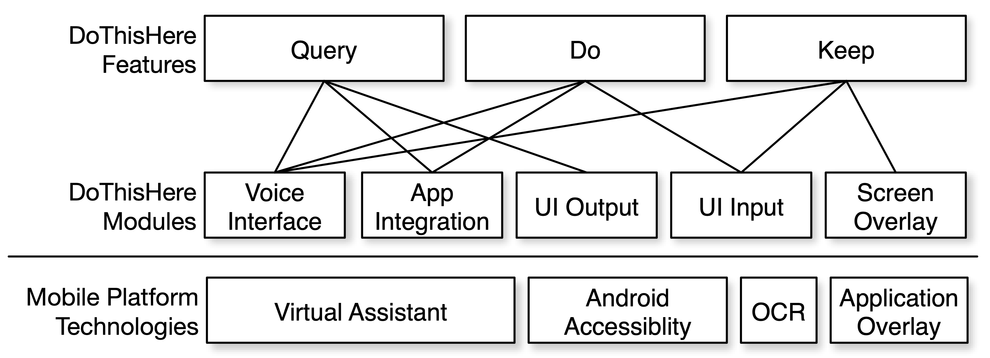
As the DoThisHere concepts deal with interactions between apps, they need to be incorporated at the operating system level. We leverage existing technologies on mobile platforms so that DoThisHere can work with existing apps without modification.
One key implementation detail in DoThisHere is its UI selection module. DoThisHere’s UI selection module allows users to quickly and accurately select UI elements for input and output while talking about the relevant action they want to perform with these UI inputs/outputs. We found out that there are two types of content that the user may want to select: UI elements or texts.
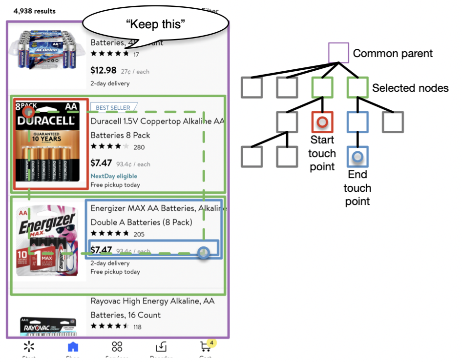
To support the selection of UI elements, we try to emulate the experience of selecting multiple items in a visual design app such as Figma or Keynote. DoThisHere gets the hierarchy of the UI elements on screen from the Android Accessibility API. The user can create a bounding box by dragging from one position to another, and all the elements intersecting with that bounding box will be selected. To make this process less error-prone, DoThisHere first finds the common ancestor (purple box) and then selects all the nodes (green box) that are direct children of that ancestor who have intersected with the selection box. See more about the rationale behind this in our paper.
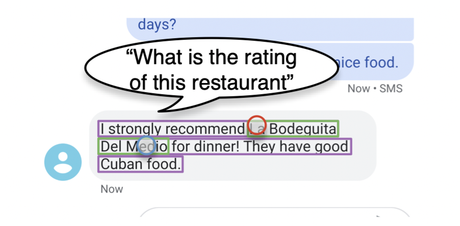
When DoThisHere detects the user’s drag movement started from one text area (shown in purple) and ended in the same text area, we use another selection method that is more natural for text selection. We treat the start and the end touchpoints as the beginning and the end of the text selection (shown in green boxes) and extract that text for the executed command.
Evaluation
Study 1: How many cross-app tasks can be supported by DoThisHere

As mentioned abovewe said before, a significant portion (59 out of 125) of cross-app tasks are not yet well-supported by mobile OSs. Among these tasks, we found that DoThisHere can potentially help users reduce the amount of task switching and mental load for on 56 of these tasks (95%).
Study 2: Task cognitive load with DoThisHere
To evaluate how well DoThisHere can help users in a real-world task, we conducted a study comparing users’ cognitive load with and without DoThisHere. As a baseline, we compared DoThisHere to the native Android navigation system.
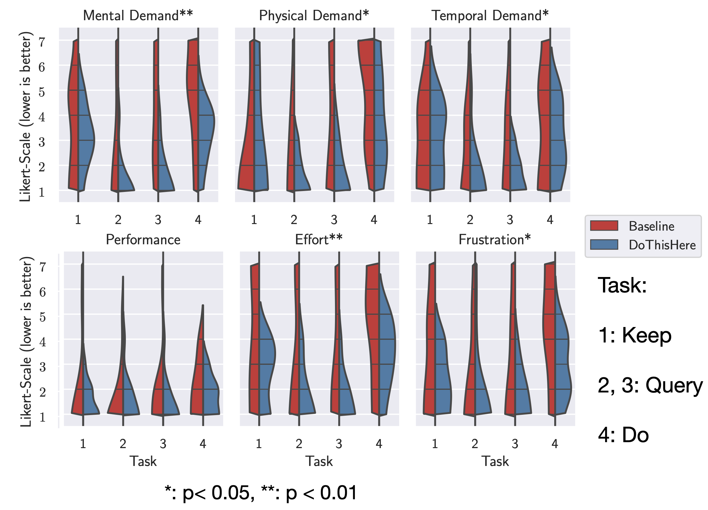
NASA-TLX results for Study 2 showed that DoThisHere can help reduce participants’ cognitive load while working on cross-app tasks. See more in the paper for a about task completion time comparison.
Conclusion
We believe every smartphone in the future should be equipped with DoThisHere to help us interact with our smartphone naturally and productively.
DOI link: https://doi.org/10.1145/3379337.3415841
Paper PDF: https://jackieyang.me/files/dothishere.pdf
Video preview
Paper talk